
Yulife is a life insurance company aimed to encourage positive changes in its users by rewarding everyday activities through its game-style app. By engaging in healthy activities like walking, meditation or cycling, a user can earn virtual Yu Coins which can be exchanged for real-life rewards like Amazon vouchers or Avios points. The statistics feature was developed as a way for the user to track and analyse their in-app activities. The statistics feature also served as a way of introducing a new visual style, which eventually rippled through to the rest of the app. I worked within an agile methodology, leading the design of the feature as well as collaborating with developers, a user researcher, a graphic designer, head of product and a copywriter throughout the process.
The Yulife app already had an “activity monitor” feature, allowing users to view their challenge history which detailed how much yucoin they had earned in their past walking, meditation or cycling challenges, and was used by an average of 35% daily active users. This high engagement rate gave the team an ambition to investigate whether improving on this feature would be a viable way to help users to better keep track of their daily activities, helping to retain and engage them more with the app through in-app feedback.
At the beginning of the project, members of the design, product, research, data and technology teams got together in order to brainstorm ideas on how we could incorporate an improved statistics feature into the app.

By collaborating with the data and engineering teams, we looked at what statistics we had available to track through the app, and agreed on an initial MVP list of statistics to include. We also looked at some of our competitor products to see what was currently being offered, and how we could potentially improve on these further. Our UX researcher then set out to do an investigation piece by ask a range of users which would be the most desirable and useful, which helped us in making our final decision.
To make the experience more personalised and gamified, I also wanted to explore a way a way of dynamically giving feedback to the user, on how they were engaging through the app. This was introduced later into the design, through the use of “feedback” cards. These were categorised into three types:
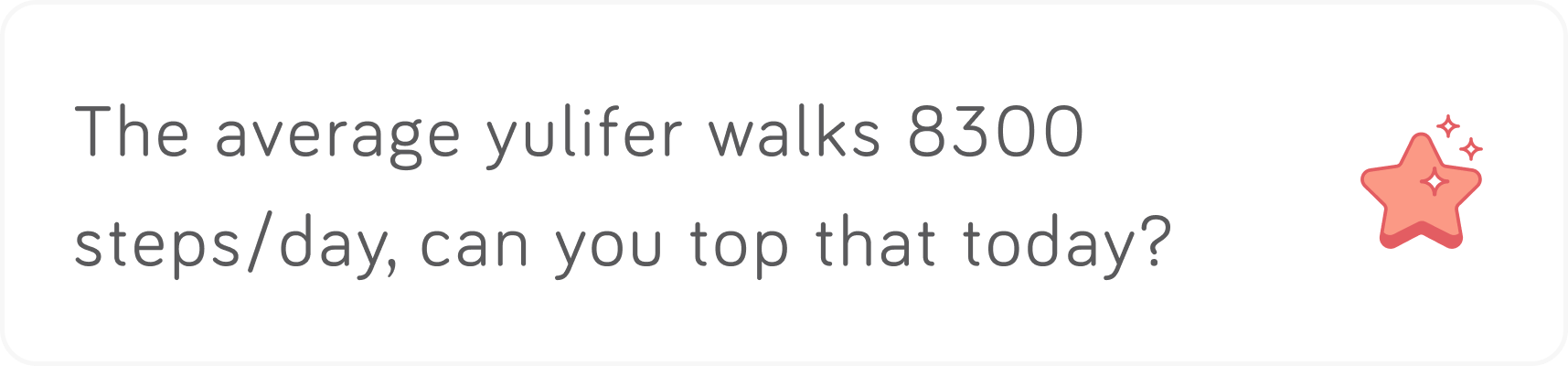
Achievement – appears if a used has performed well, and has a statistic which is more than the average yulife user (e.g. they have more daily steps or have earned more life time yucoin).

Motivational – promotes activities which the user doesn’t do as much, or at all, by stating the benefits to do with the activity.
Insight – If the user is performing well, but not above average, present interesting facts to do with the exercise to keep them motivated and interested.

I began the design process by looking for inspiration from health and fitness apps as well as designs on Dribble and art styles on Pinterest. This helped me to better understand how we could visualise our data in effect and appealing ways.

After we had collated our specifications, we began designing wireframes. This allowed us to define the hierarchy of the page, as well as serving as a base for the visual design. We did numerous iterations, and met frequently in our weekly catch up sessions in order to iterate a final version which would be ready to take into visual design and testing.

Before reaching the final design, I designed numerous versions of the screen in order to get all of my initial ideas out. These were then fed back into the head of product, as well as being shown to some of our user base, and were iterated upon dependant on their feedback.

The design team decided that this would be a good opportunity for us to begin setting a new style for the app, so it could be gradually rolled out into the other parts of the user interface over time. Therefore, it was essential that our new typography and visual specifications were all documented thoroughly throughout the process, so we could seamlessly integrate the style with the rest of the app in the future.


To avoid any ambiguity during development, it was essential for me to document how the statistics were being tracked, what was included in the metrics for each statistic, as well as the logic on how the “feedback” cards were presented to the user. I documented everything thoroughly on our company Wiki, and linked them to our product stories.

Throughout the design and development process, I kept in frequent contact with two engineers and a graphic designer who were working remotely on the project. We would speak daily, and talked about any potential problems or improvements we could make. We worked within an agile methodology, and improved on some of the initial specifications and designs when we would come up with a better solution to a problem, if it did not affect the delivery of feature.

Once the designs were completed, we set out to gain early feedback on the designs by setting up usability tests on lookback, to determine whether users were understanding what each section meant.


